5334 Timber Ridge Trail
Clarkston, MI, 48346
248-602-5003
Your Custom Text Here

Your Custom Text Here
It was a privilege to work on GM's iconic nameplate. While servicing the brand, I had the opportunity to design several high-profile marketing and strategic launches.
The first was the Cadillac Le Mans Sponsor Kit, given to potential corporate sponsors to help fund the Cadillac Le Mans race team. I then went on to create a monthly dealer newsletter called Wreath & Crest. The newsletter informed and educated the dealership sales staff on product innovation and current events that surrounded the brand.
The most exciting project for Cadillac was the launch of its first SUV, the SRX. The SRX dealer/consumer catalog was designed using vellums to highlight the luxury nature of the innovations and technologies that were integrated into the SRX design. The book’s concept of "Fire & Ice" was shot in Iceland under my direction, and paired key vehicle features to strategic locations in Iceland. The catalog won a gold Mobius Award for excellence in the creation of brochures.
With the success of the SRX book, I went on to design and execute the new STS book. The concept was clean and premium. The book’s elegant construction began with a soft touch cover design, an industry first for an American car company. Another successful component of the books makeup was the use of minimalist spreads. Each of the books pages romanced the technologies, sheet metal, and innovative engineering of the Cadillac STS.
The idea of elegant design and pristine execution were translated throughout each and every Cadillac consumer touch point including collateral, point of sale, and branded accessories.
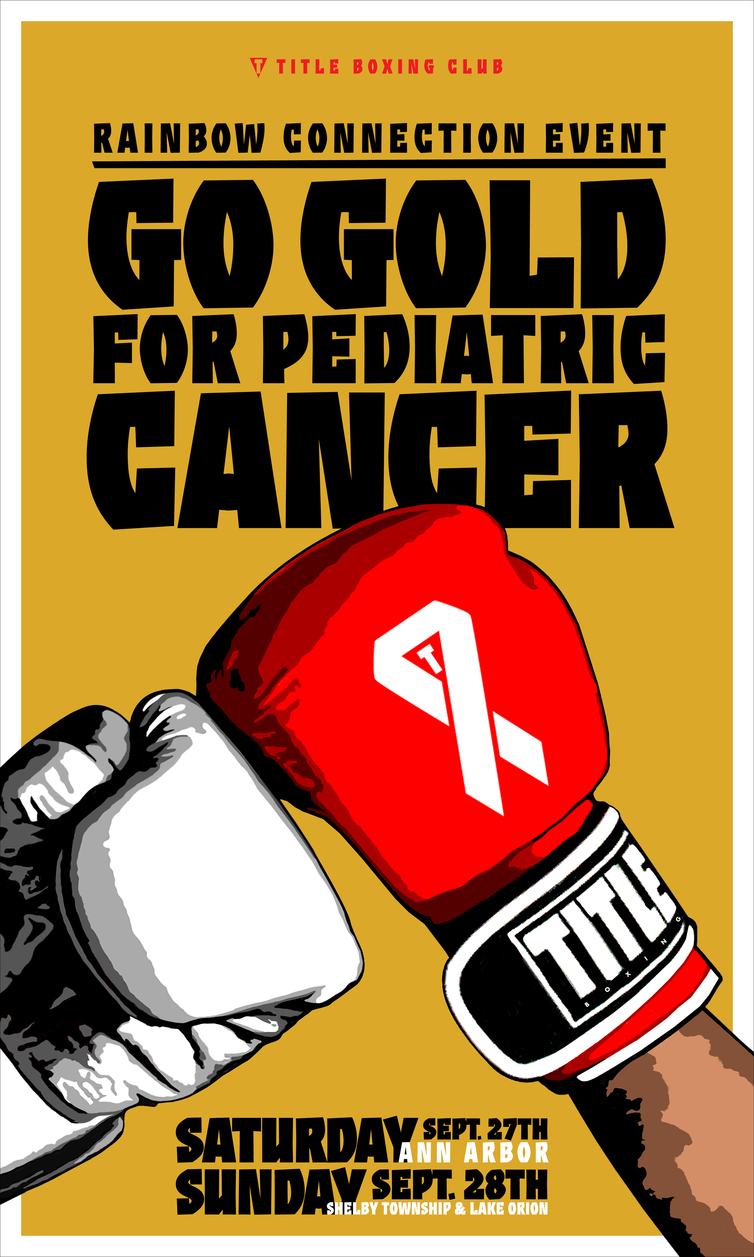
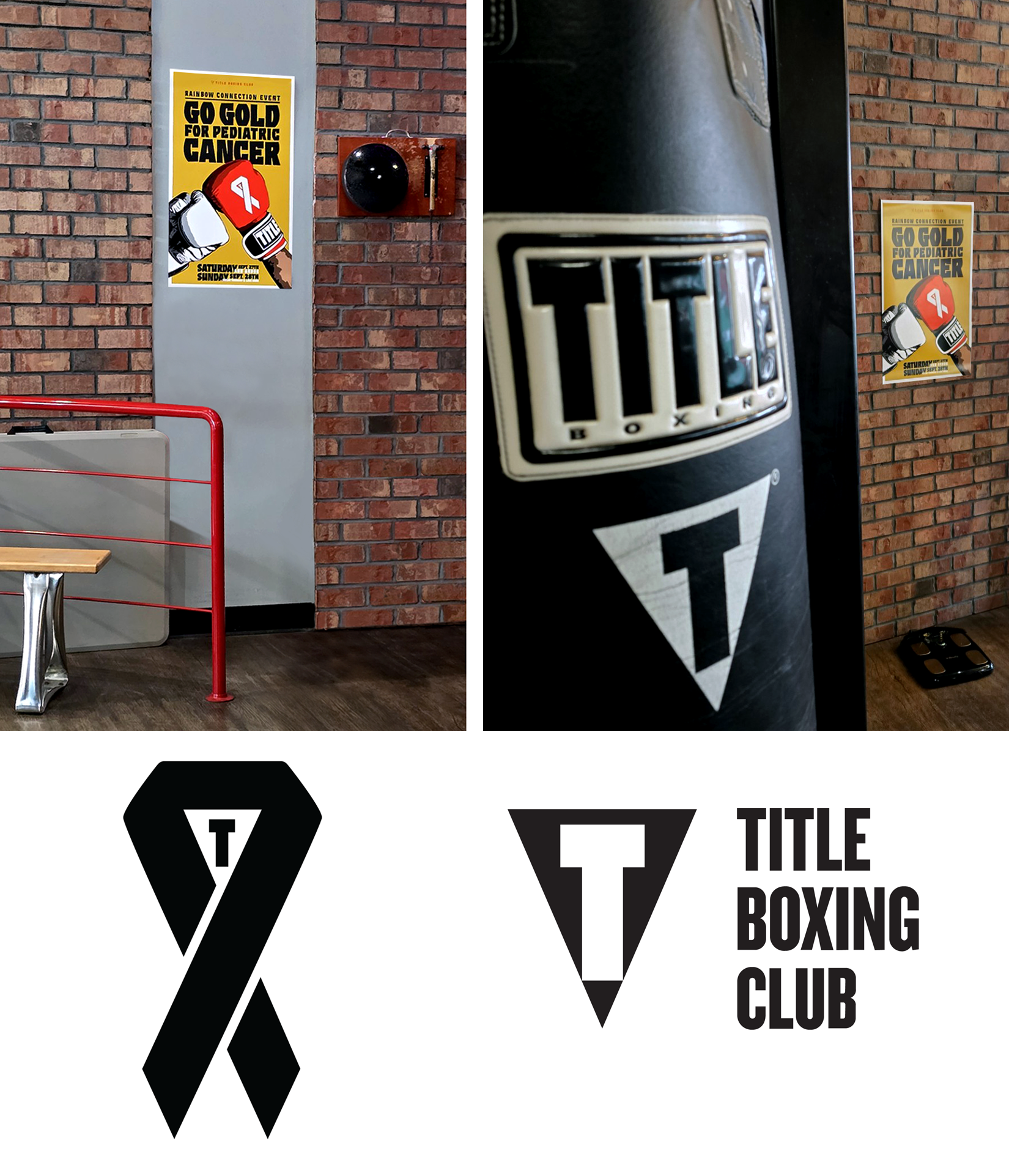
Fighting for Gold
Design has power when it connects to something bigger than itself. For this print campaign, I teamed up with Title Boxing Club to support The Rainbow Connection, raising funds under the banner Go Gold for Pediatric Cancer. The concept was simple but strong: put the fight front and center.
The poster art fused two worlds—boxing as a symbol of strength, grit, and training to win, and the resilience of kids battling life-threatening illness. At the heart of the design was a custom designed ribbon I created, uniquely branded with the Title “T”. This gave the cancer awareness symbol a new edge—instantly recognizable to gym members and visually powerful alongside the boxing gloves.
It wasn’t just about posters on a wall. It was about rallying a community. The design gave the event a bold identity, a rallying cry that turned awareness into action, and helped Title Boxing and The Rainbow Connection raise money that makes a real impact for local Michigan families.
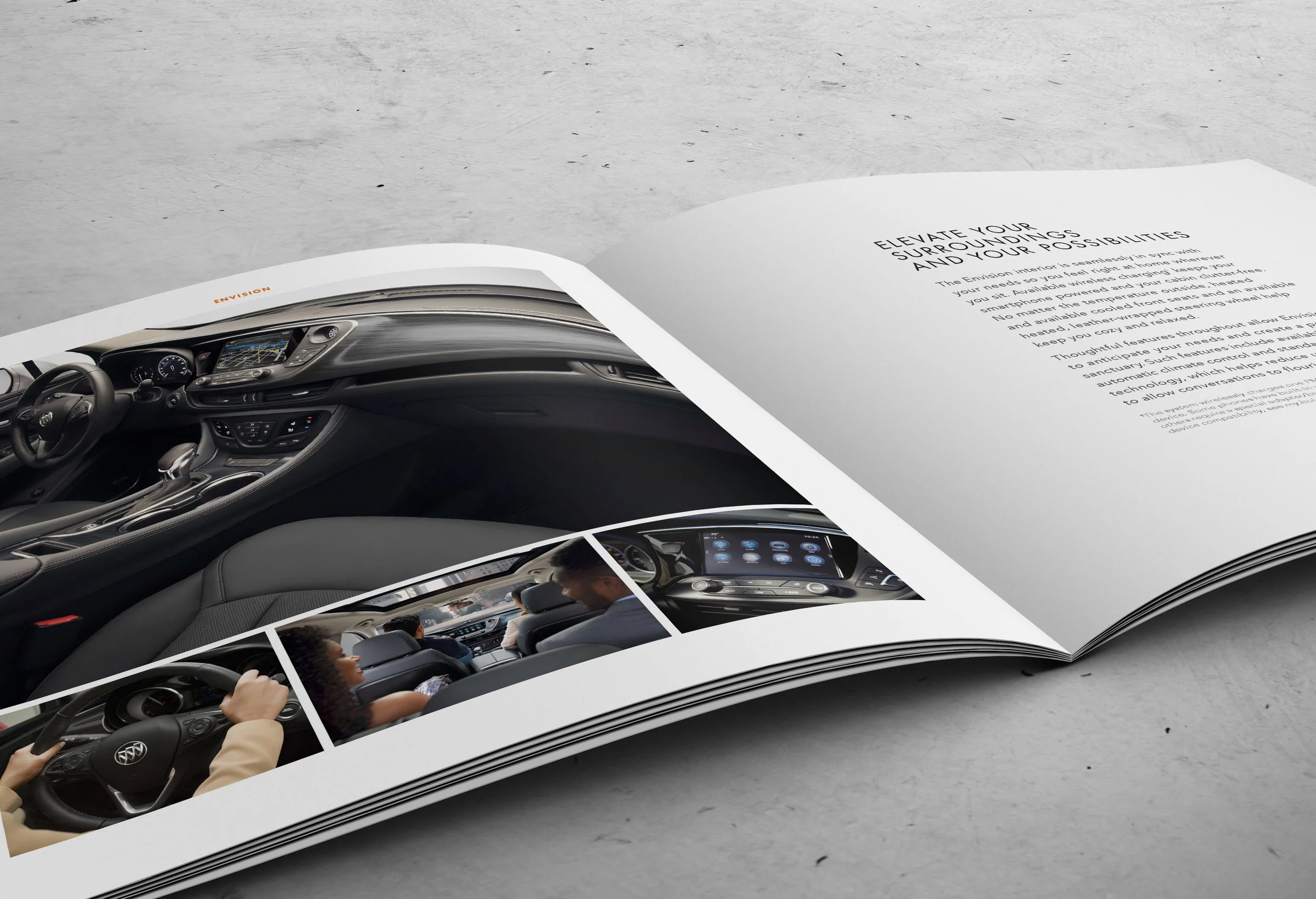
It always starts with one key project or launch. For 2016, it began by designing the Buick Cascada Dealer Catalog. This book would be the foundation design that all other Buick catalogs would be based on. The importance of the launch? The last Buick convertible was twenty-five years prior, so pretty important.
The catalog was executed around the idea of pure, premium design where white space is considered an amenity. My approach was clean graphic design and warm inviting photography. This aesthetic would run for two consecutive years, with minor changes to type and visual elements.
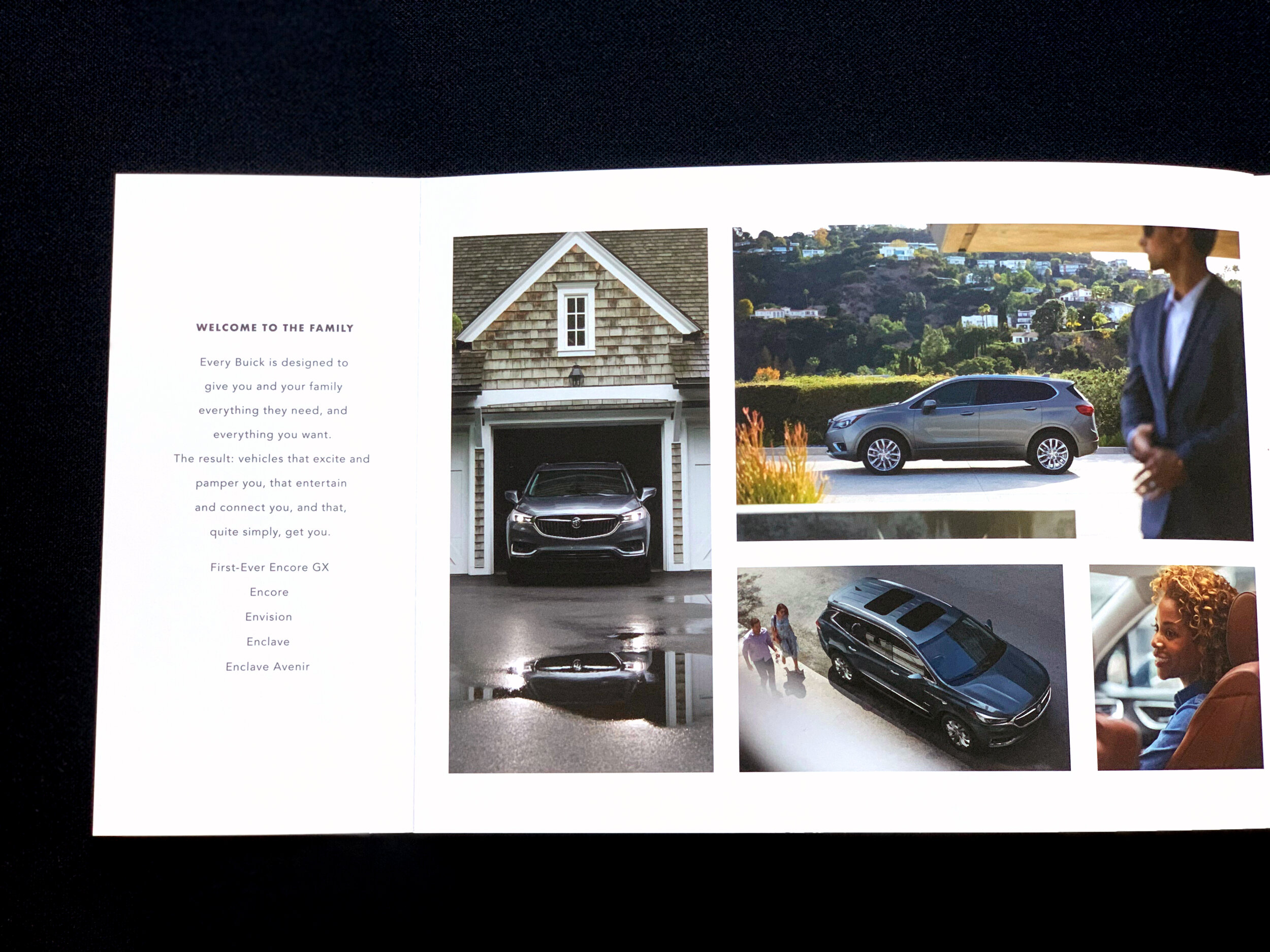
A brands first impression may times is at an autoshow. This elegant 7 by 7-inch square autoshow book was concepted to feel like an art exhibit or gallery book. It begins by delivering the Buick brand message, then reveals each vehicle with an image and brief description. Halo brand vehicles received a exterior spread followed by an interior spread with key feature images and copy. The design is simple and elegant and the soft touch printing technique makes each spread a tactile experience. The book is a premium and luxurious expression of the Buick brand.
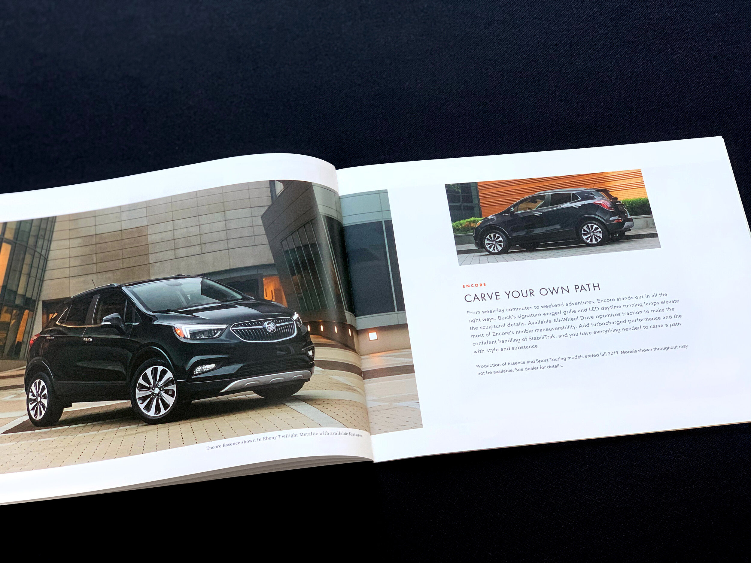
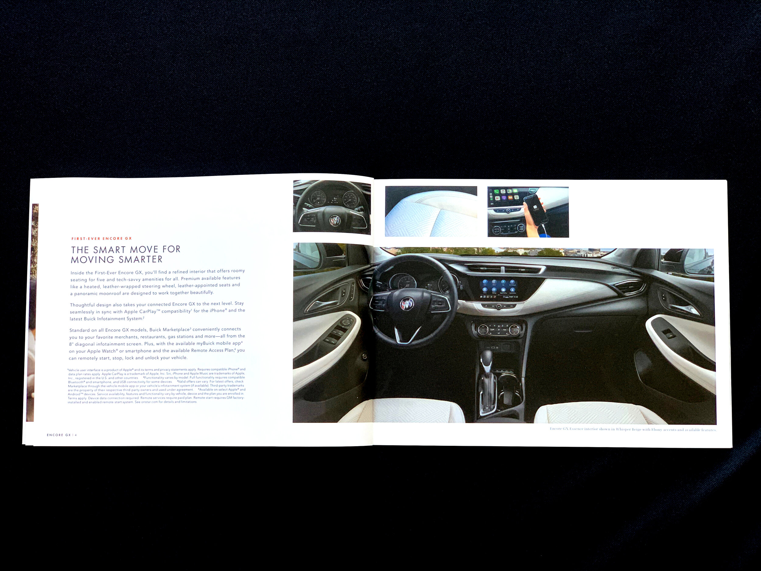
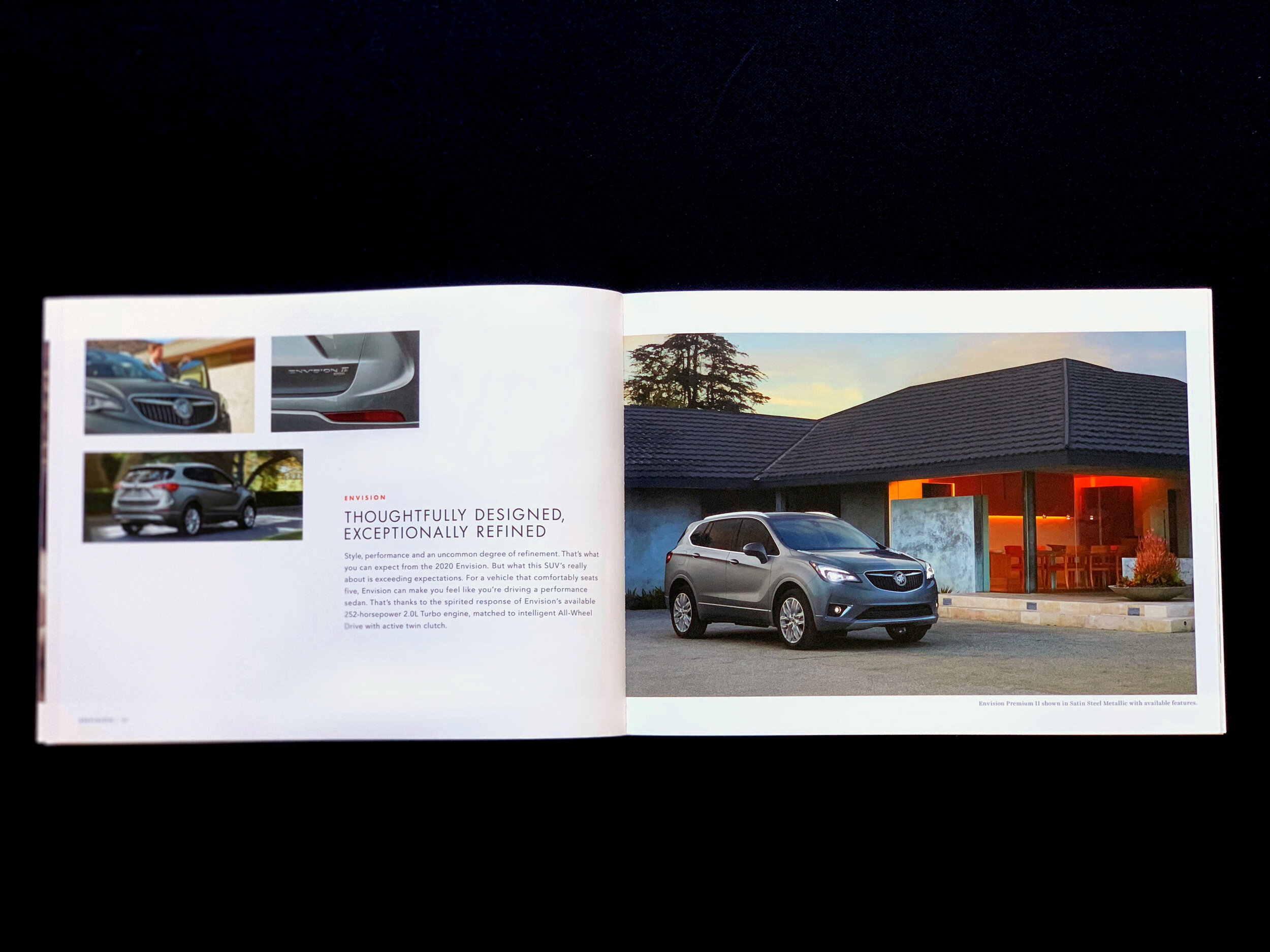
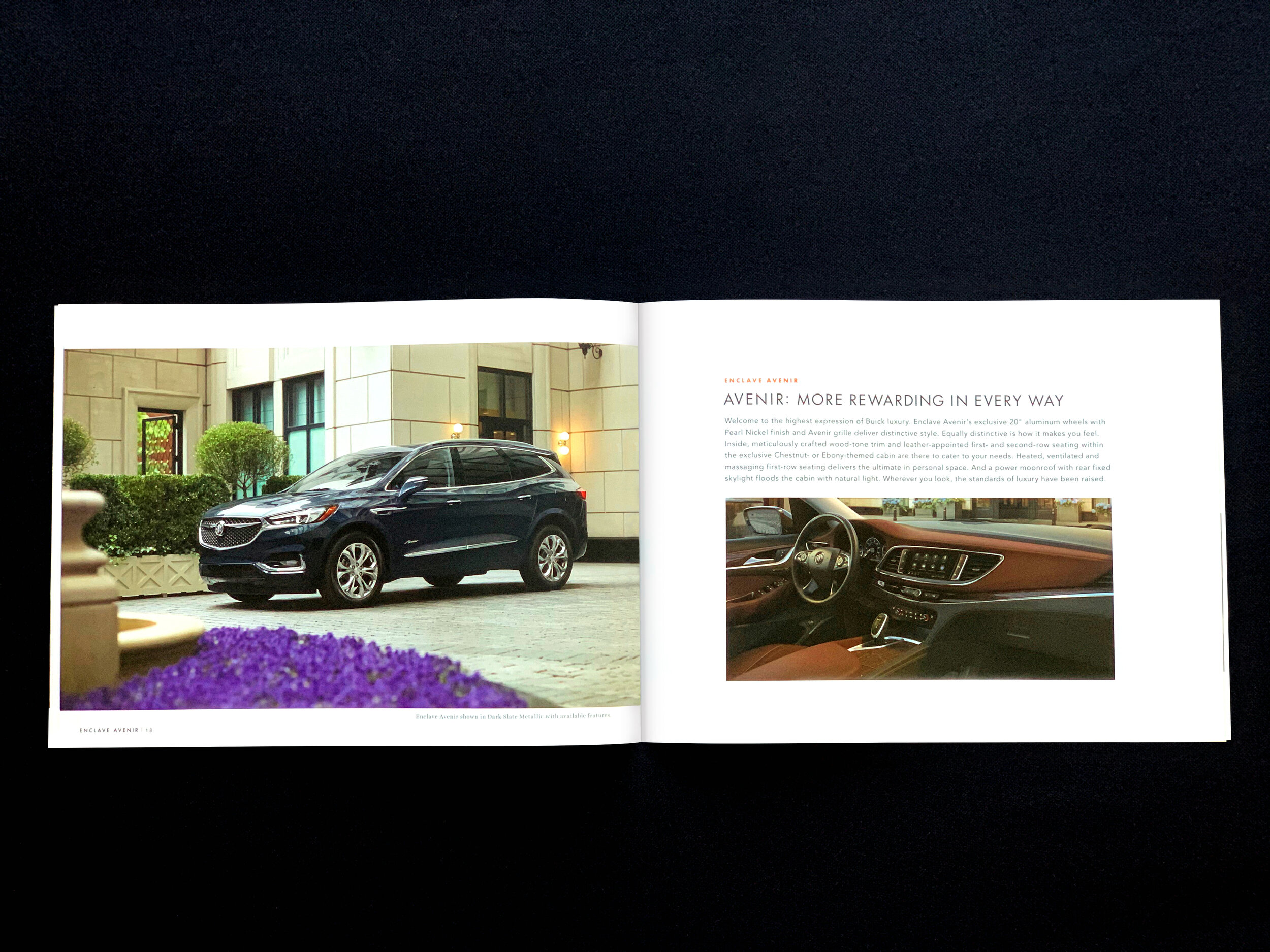
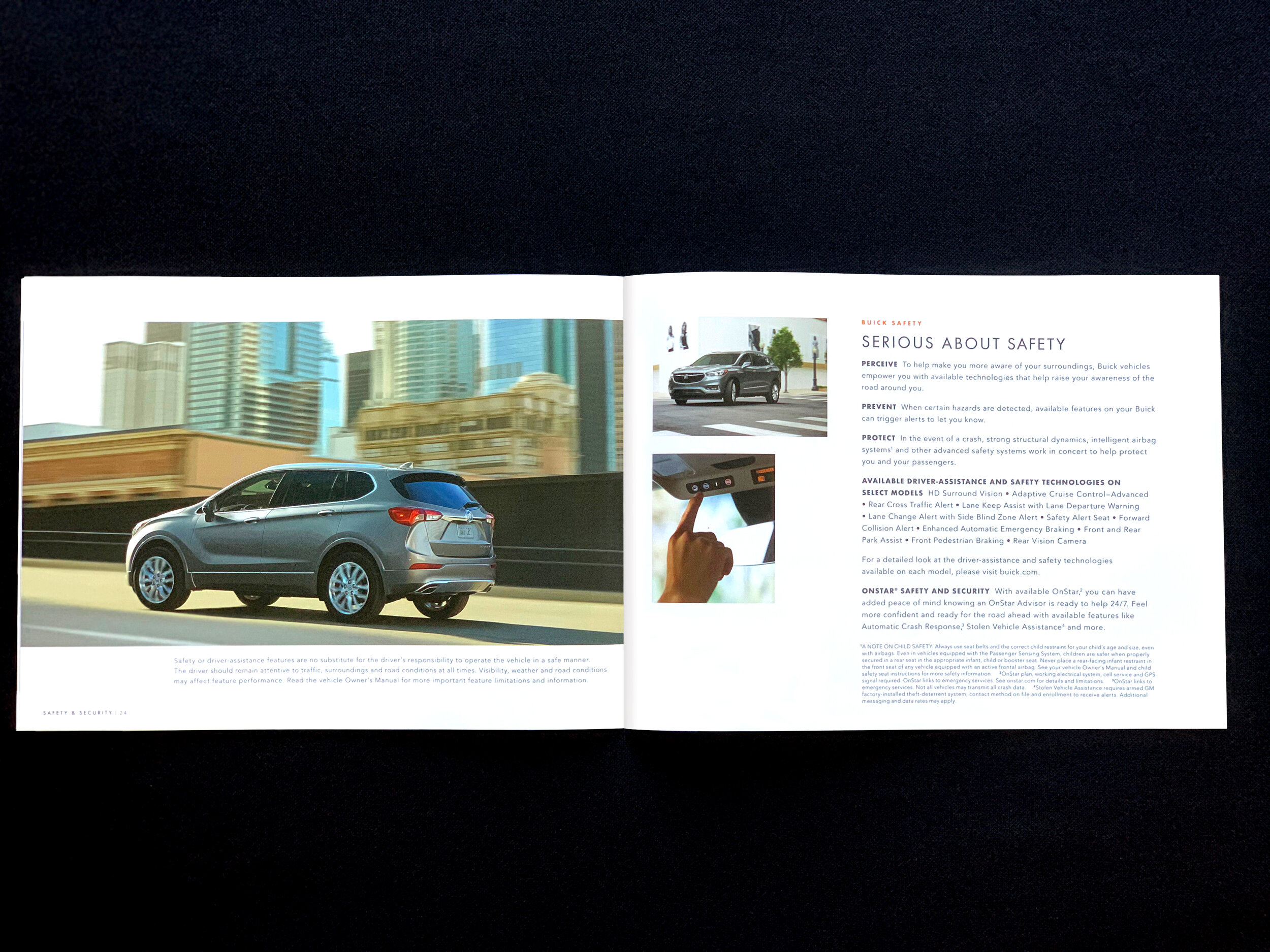
I designed and executed this autoshow book for Buick at the peak of its brand offering. The beginning of the book showcased the new Avenir line, a top trim level, as well as all its luxury sedans and SUV offering. The book was designed to show the exterior as one spread and the next spread to detail the interior and key features of that vehicle. The design demonstrates a clean and elegant approach to the premium line up of the Buick brand.
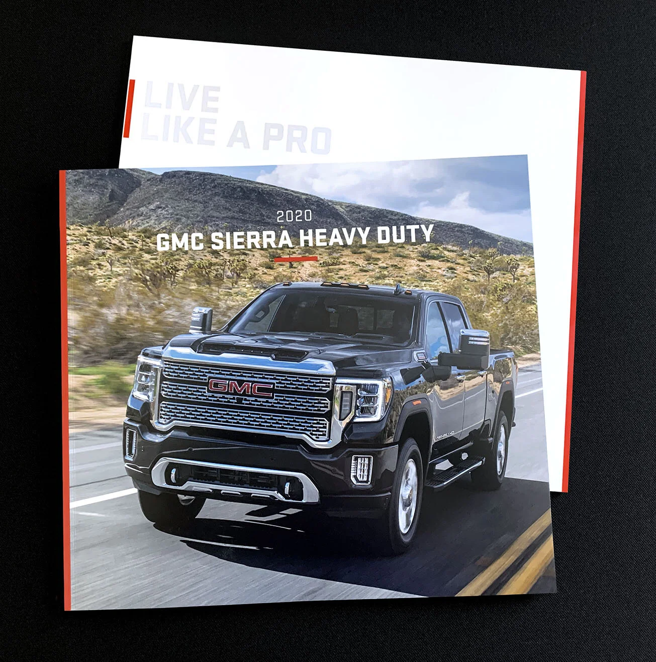
The GMC Sierra Launch Book assignment started as a simple auto showpiece to launch the new Sierra the halo vehicle for GMC. The client wanted to show the new exterior and interior design and a shopping list of new technologies inside and out. The budget was limited and some untraditional designs and ideas were considered.
Based on timing and the importance of the Sierra launch, my partner and I created this catalog design to showcase the many new features of this important launch for GMC. We shot the vehicle at Spaceport, an independent enterprise to take everyday people into space, as a backdrop to demonstrate groundbreaking design and high tech features.
The first printing for the auto show had a red band at the top right of each book which had to be broken to view the inside pages. This specialty book and its imagery was later used for the website and many other marketing materials for GMC Sierra.
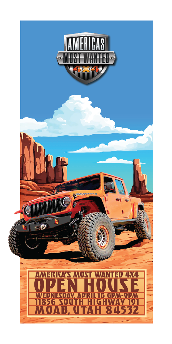
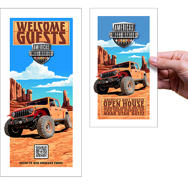
When America’s Most Wanted 4x4 headed to the 2025 Easter Jeep Safari in Moab, we wanted more than just a presence—we wanted connection. I designed a bold graphic visual identity that I translated into posters, handouts, and open house invites, each one built to stand out in the red rock landscape and capture the attention of Jeepers in town.
From large-format event posters to hand cards, the creative blended AMW4x4’s brand power with Moab’s rugged energy, giving fans, influencer’s and future customers a reason to engage. These pieces worked on the ground to spark awareness, build anticipation for our open house, and draw Jeep enthusiasts directly into the AMW4x4 experience.
AMW4×4 Event Poster
Open House Poster and Invitation
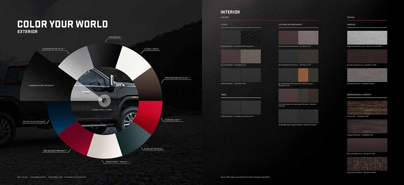
The 2020 GMC heavy-duty catalog is a reflection of big bold truck design and capabilities through the large physical size of this 12 x 11 inch, 48 page book. The books large size allows for big stunning photography demonstrating its many outstanding heavy-duty capabilities. GMC brands precision styling and design is reflected in a formal and precise grid system and structured overall look. The truck was all-new that year and it took a lot of effort to design and help clients organize the flow of this large book, so that consumers would be able to realize all of the trucks amazing features in a logical way. I designed this vehicle catalog as a tool for the dealerships and the consumer, while maintaining the brands precision styling look.
This is a good example of the 2019 Buick catalog design for the brand. All of the books use the same structure and design elements derived from the web page designs. This simple and structured format set the look and tone, so that the Buick site and catalog design had a consistent look across both consumer touch points.
As the Creative Director I was responsible for all of the Buick photography and retouching for the brand.
Creating collateral for a premium brand like GMC is an exciting task. Using printing techniques, and an elegant design helped pull these books together.
The first part of this yearly assignment was to create a GMC Auto Show Book that features every member of the GMC line-up while contrasting the base model with the famed Denali trim level of each model. Every spread featured the two trim levels of the vehicle and its key attribute, from premium interior compartments or world-class technologies. It was also important to dedicate a spread that spoke to every technology and safety feature built into each GMC.
Later, each GMC received its own book, utilizing the same design and print techniques used in the auto show book. These catalogs complemented the auto show book and worked together as a cohesive group in the dealership and at events. Each book features exterior design cues and the premium appointments consumers expect from a brand like GMC and the Denali trim level.
The architectural photography was representative of each GMC vehicle. This pairing demonstrated how GMC set a high standard in its use of design, materials, and engineering. We created a photographic style and specific lighting that the brand could own and was unique in its segment. Using low light or "premium dusk," we shot each vehicle with a unique background to create a look and mood that accentuated the GMC professional style.
The 2015 GMC Catalog Covers shown here utilize a simple compartment style design. The same idea is used throughout the books to help organize and compartmentalize key vehicle attributes. The concept reflects GMC buyers who are organized and systematic in their approach to their daily lives.
The auto show cover this year featured the jewelry of the Sierra’s signature grille and inside spreads use the same organization design as the individual catalogs.
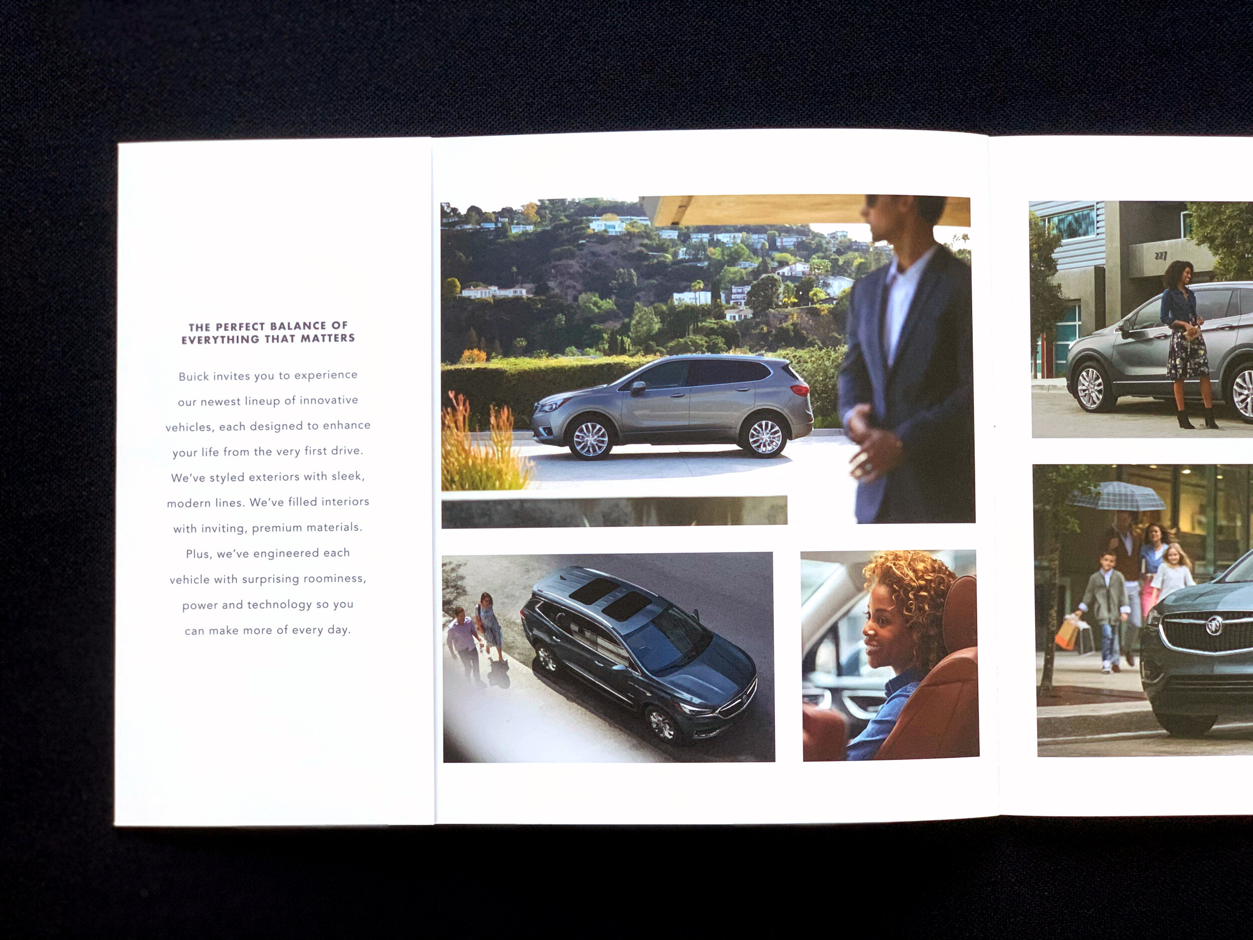
Buick auto show attendee is invited inside this full line book to experience the newest lineup of premium and innovative vehicles. It’s designed to introduce the reader to each vehicle and how it will enhance their lifestyle. Pages present each for the vehicles exterior then its interior styling, before revealing another vehicle of the brand. Final spreads romance the innovation, safety and technology details through images and precise copy.
The book cover for North America features the Enclave for the U.S version, while the Canada version showcases the new Encore GX in white. Covers where designed by agency designer Lilly Lee under my direction.